Sunday, July 31, 2022

Implementing a "mini-LaTeX" in ~2000 lines of code

A preliminary note

The previous blog post on this subject got posted to hackernews. The comments were roughly like the following (contains exaggeration, but only a little):

The author claims to obtain superior quality compared to LaTeX but after reading the first three sentences I can say that there is nothing like that in the text so I just stopped there. Worst! Blog! Post! Ever!

So to be absolutely clear I'm not claiming to "beat" LaTeX in any sort of way (nor did I make such a claim in the original post). The quality is probably not better and the code has only a fraction of the functionality of LaTeX. Missing features include things like images, tables, cross references and even fairly basic functionality like widow and orphan control, italic text or any sort of customizability. This is just an experiment I'm doing for my own amusement.

What does it do then?

It can take a simple plain text version of The War of the Worlds, parse it into chapters, lay the text out in justified paragraphs and write the whole thing out into a PDF file. The output looks like this:

Even though the implementation is quite simple, it does have some typographical niceties. All new chapters begin on a right-hand page, the text is hyphenated, there are page numbers (but not on an empty page immediately preceding a new chapter) and the first paragraph of each chapter is not indented. The curious among you can examine the actual PDF yourselves. Just be prepared that there are known bugs in it.

Thus we can reasonably say that the code does contain an implementation of a very limited and basic form of LaTeX. The code repository has approximately 3000 total lines of C++ code but if you remove the GUI application and other helper code the core implementation only has around 2000 lines. Most of the auxiliary "heavy lifting" code is handled by Pango and Cairo.

Performance

The input text file for War of the Worlds is about 332 kB in size and the final PDF contains 221 pages. The program generates the output in 7 seconds on a Ryzen 7 3700 using only one core. This problem is fairly easily parallelizable so if one were to use all 16 cores at the same time the whole operation would take less than a second. I did not do exact measurements but the processing speed seems to be within the same order of magnitude as plain LaTeX.

The really surprising thing was that according to Massif the peak memory consumption was 5 MB. I had not tried to save memory when coding and just made copies of strings and other objects without a care in the world and still managed to almost fit the entire workload in the 4 MB L2 cache of the processor. Goes to show that premature optimization really is the root of all evil (or wasted effort at least).

Most CPU cycles are spent inside Pango. This is not due to any perf problems in Pango, but because this algorithm has an atypical work load. It keeps on asking Pango to shape and measure short text segments that are almost but not entirely identical. For each line that does get rendered, Pango had to process ~10 similar blocks of text. The code caches the results so it should only ask for the size of any individual string once, but this is still the bottleneck. On the other hand since you can process a fairly hefty book in 10 seconds or so it is arguable whether further optimizations are even necessary,

The future

I don't have any idea what I'm going to do with this code, if anything. One blue sky idea that came to mind was that it would be kind of cool to have a modern, fully color managed version of LaTeX that goes from markdown to a final PDF and ebook. This is not really feasible with the current approach since Cairo can only produce RGB files. There has been talk of adding full color space support to Cairo but nothing has happened on that front in 10 years or so.

Cairo is not really on its own in this predicament. Creating PDF files that are suitable for "commercial grade" printing using only open source is surprisingly difficult. For example LibreOffice does output text in the proper grayscale colorspace but silently converts all grayscale images (even 1-bit ones) to RGB. The only software that seems to get everything right is Scribus.

Thursday, July 28, 2022

That time when I accidentally social engineered myself to a film set

I spent the last week in Toronto in the Cpp North conference. It was so much fun just to hang around with people after such a long pause.My talk was about porting large code bases from one build system to another, using LibreOffice as an example The talk should eventually show up on Youtube but there is no precise schedule for that yet.

After the conference ended I had a few spare days to do touristy stuff which was also fun. On the last day when I was packing my stuff I noticed that there was a film crew just outside the conference hotel clearly shooting something. The area did not seem to be closed off so obviously I went in to take a closer look. It was past 9 pm and I only had my phone camera so all the pictures below are a bit murky. On the other hand you can clearly see just how much lighting power you need to shoot high quality video material.

Another thing you pick up quite quickly is just how much stuff a film set requires. Here is an assorted selection of props and costumes that took up a major fraction of a side street.

After hanging around for a while a person belonging to the crew noticed me and we started chatting. Once it became known that I was from Finland we had the legally mandated Canada–Finland hockey discussion. Then he told me all things about the set, which was filming a new series for Apple TV. He also told me the name of the series and what sort of scene they were going to shoot next.

This is where things got interesting. In the couple of hours I spent looking at the set, there were tens of people who walked by and asked the security people what they were filming. They got one of two answers. The first one was a name for a series that was different than the one I was told. The second answer was "this is a new series with a largely unknown cast". This answer sounded very specific and very rehearsed. Based on some research I did later the series name I was given was probably the correct one. It's a bit strange that they had a fake name for the production but there you go (it is possible that the other name given to people was the episode name rather than the series name but this is just speculation).

Regardless of the name, the series takes place in New York so they had staged the street to look like a typical Manhattan street. This included a fair amount of detail that you might think would be done cheaply with CGI instead.

They had NY street signs and trash cans (not shown in the image, but the street name was "John st"). The things at the bottom marked with a red arrow are fake garbage bags. They even had a fake US style ATM, marked with the other red arrow. The water truck and was used to make the street wet, probably because the scene takes place after rain. They actually re-wet the street multiple times to maintain consistency. The only noticeable issue was that all cars on set had Ontario plates. Maybe they are counting on that not showing up on screen.

However the most important things you need to stage New York are actually smoke generators. Lots and lost of smoke generators. There were several big ones on the street, the garbage cans had ones, even the aforementioned ATM had its very own smoke machine. Don't really know if that is relevant to the plot or whether ATMs in New York run on steam.

As I stood on the street watching people go about their business eventually I noticed something strange. They started gathering more and more film equipment around me. There were a bunch of cameras, lights and I could clearly hear people planning the lighting et al for the shoot. Eventually I realized that they were building the "control center" (whatever its actual name is) of the set around me. This is what it looked like from the outside.

I stood next to one of the pillars shown in the middle of the picture next to a thing that looked suspiciously like a director's chair. I just leaned against the wall perfectly still while remaining calm and passive and nobody paid any attention to me at all. I could observe the crew going about their business,  browse their monitors (which, sadly, did not show anything interesting) and even see their uncannily realistic looking baby prop up close. I was probably there for around 30 minutes or so until someone finally asked me if I was part of the crew and then kindly asked me to leave which I did.

This was probably for the better as soon they started filming actual scenes and I could get a lot better look from the opposite side of the street. Watching the operation made it immediately obvious why shooting professional video is so expensive. The crew consisted of around 40-50 people who all seemed to work a full day well past midnight on a Friday. In the three hours I spent observing the operation they managed to film two scenes, each one lasting around 15 seconds.

All in all if you ever get the chance to observe a film crew in operation I highly recommend it. It is a better "making of" experience than any professionally produced featurette or documentary. The main reason being that it is about the actual making of instead of of millionaires lying through their teeth on how all other millionaires on set were so professional, super awesome and how the whole experience was the best thing ever because that is what they are contractually obligated to say. In person you get to see actually interesting things like how a camera operator puts on a weird Doctor Octopus carrying harness or how a team of tech workers builds and balances a 10+ meter long dolly track from scratch in under ten minutes. It is quite impressive.

Monday, July 11, 2022

Further adventures in creating a custom math-themed jigsaw puzzle

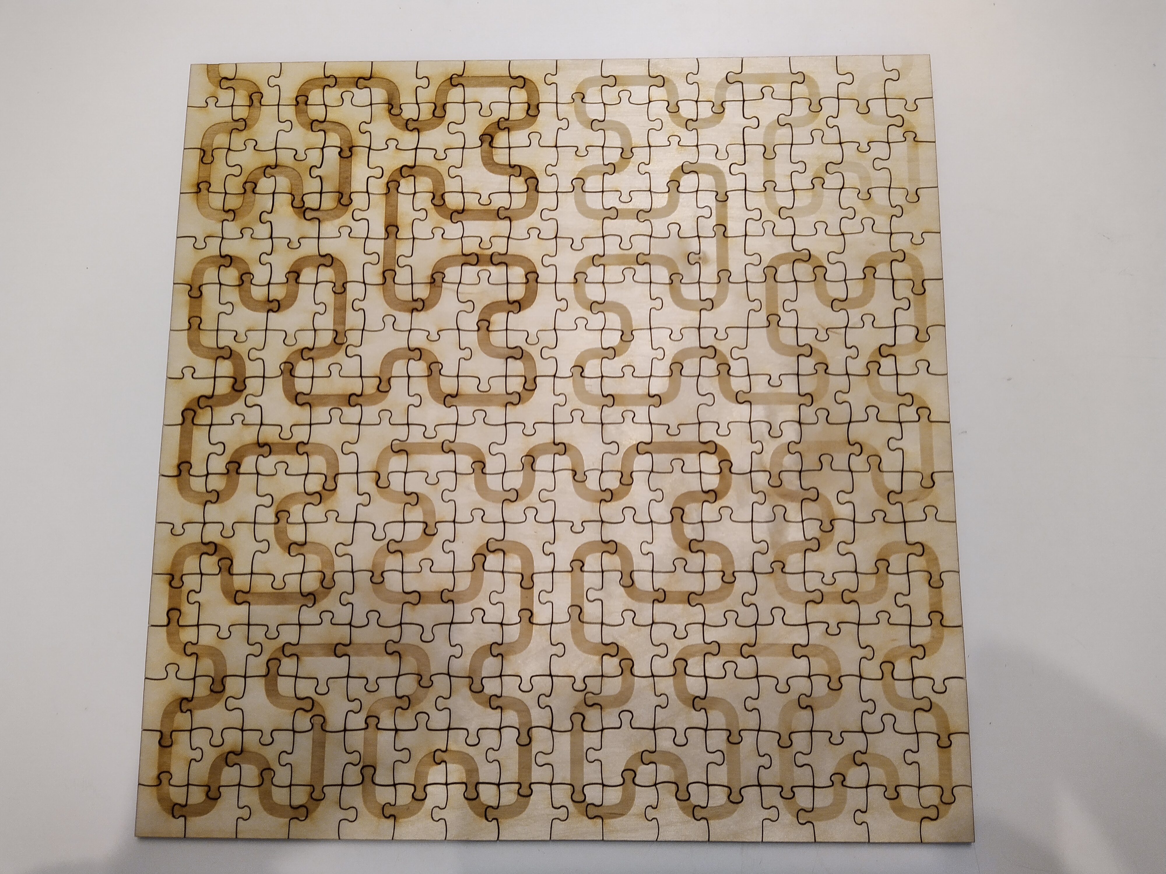
In the previous post we looked at creating a custom jigsaw puzzle from scratch using a laser printer and engraver because jigsaw puzzle manufacturers would not disclose their printing and cutting tolerances. As a refresher, here is what the end result looked like.

After assembling this puzzle once the main issue became apparent quite immediately. The curve needs to have a smooth linear gradient from black to white. Since this is a 256 piece puzzle it would require 256 discrete gray levels. Unfortunately the engraver can't achieve this level of precision. There are maybe 64 different achievable levels in practice and different parts of the plywood board react differently to the laser. Thus it is actually fairly difficult to judge where any given piece should go and assembling the final puzzle was not really fun. Back to the old drawing board, then.

The only other way of doing this seems to be to print the artwork to a separate sheet of paper, glue it to a plywood board and then cut the end result with a laser cutter. The problem with this is that you need to be very precise with registration. Even if you get the alignment perfect in one corner, it can be completely off in the opposite corner if the printed artwork gets glued down at an angle. Individual pieces are about two centimeters on each side so if the pattern is off by more than a few millimeters the end result looks bad.

The only real way of finding out whether this is possible is to try it out. Therefore:

Hilbert's Rainbow

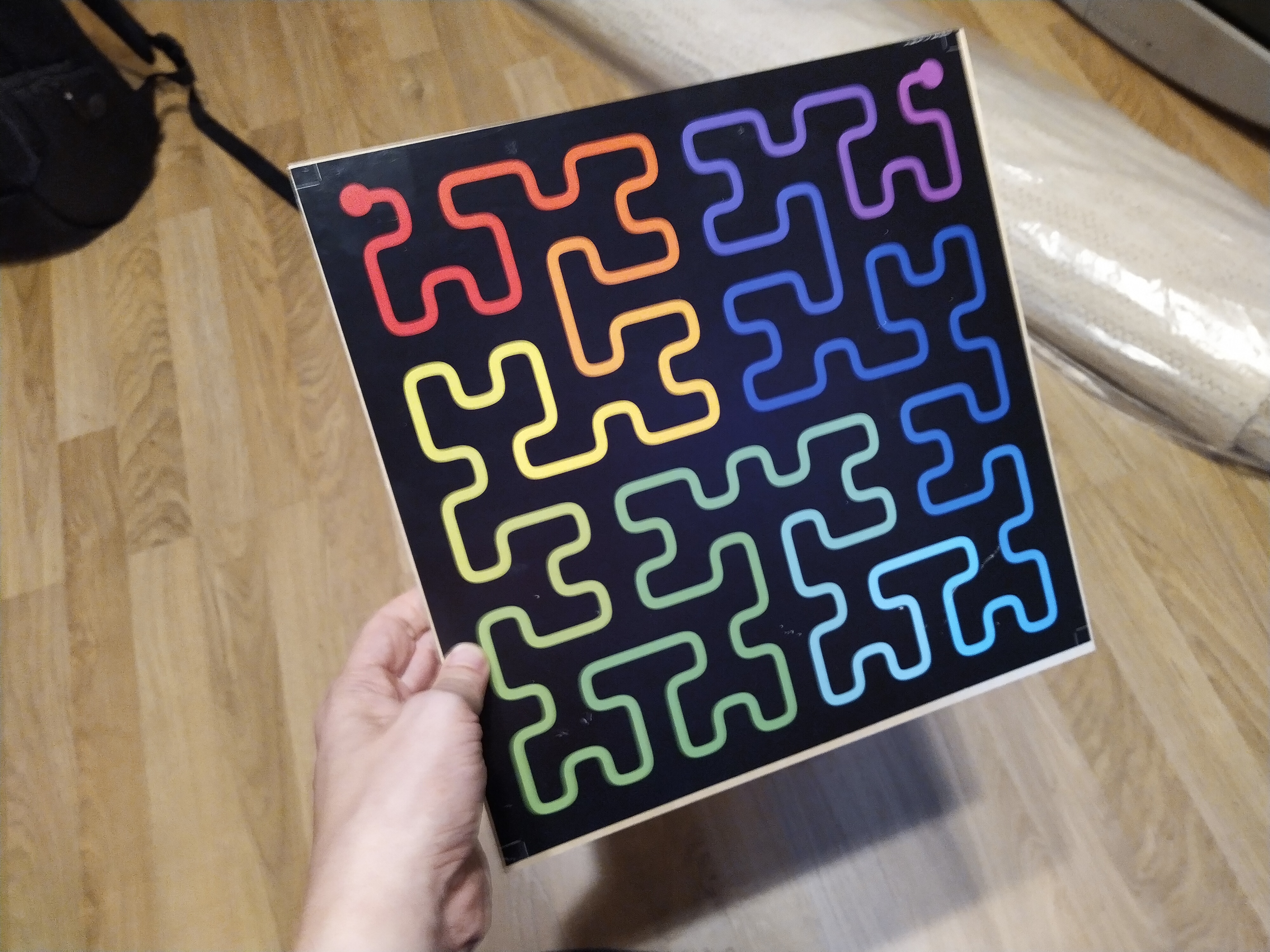
Here is the artwork printed and glued to a 30 x 30 cm plywood board. If you look at the picture carefully you can see that a) the plywood is not exactly square b) its angles are not at exactly 90 degrees to each other and c) the artwork got glued at a slight angle. Moving the paper after it was first laid down was really hard, even though the glue was still wet. Those with sharp eyes might even notice the white registration marks in the corners that are used to align the laser. I had to leave additional comments for the printing shop that the things that look like crop marks are in fact not crop marks and that they need to be left in the final printout.

Onwards to the laser!

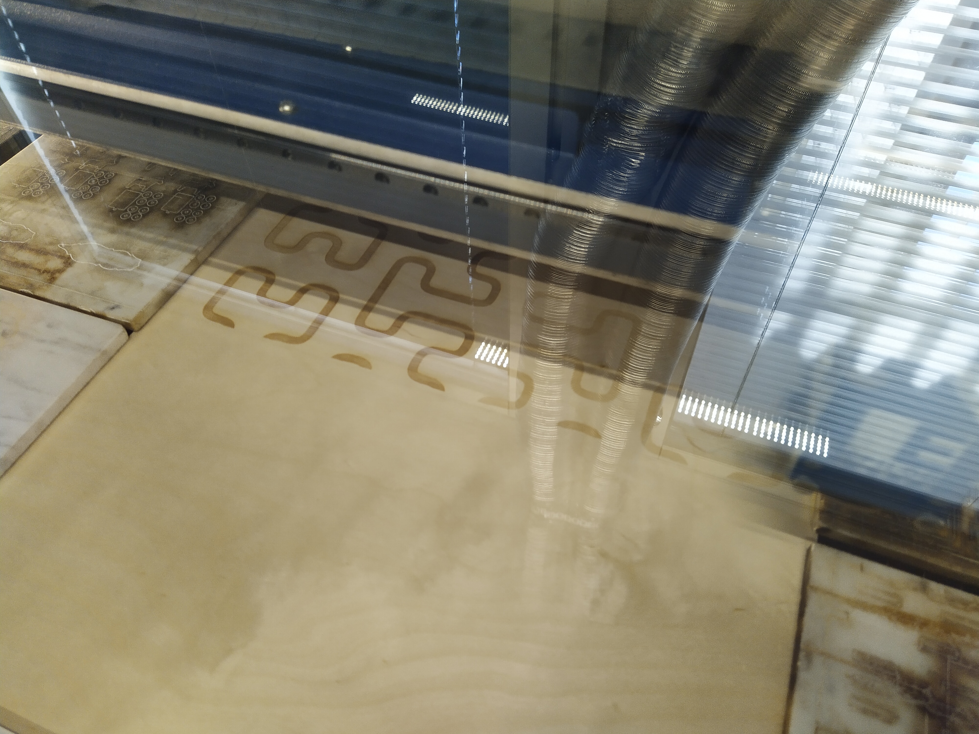
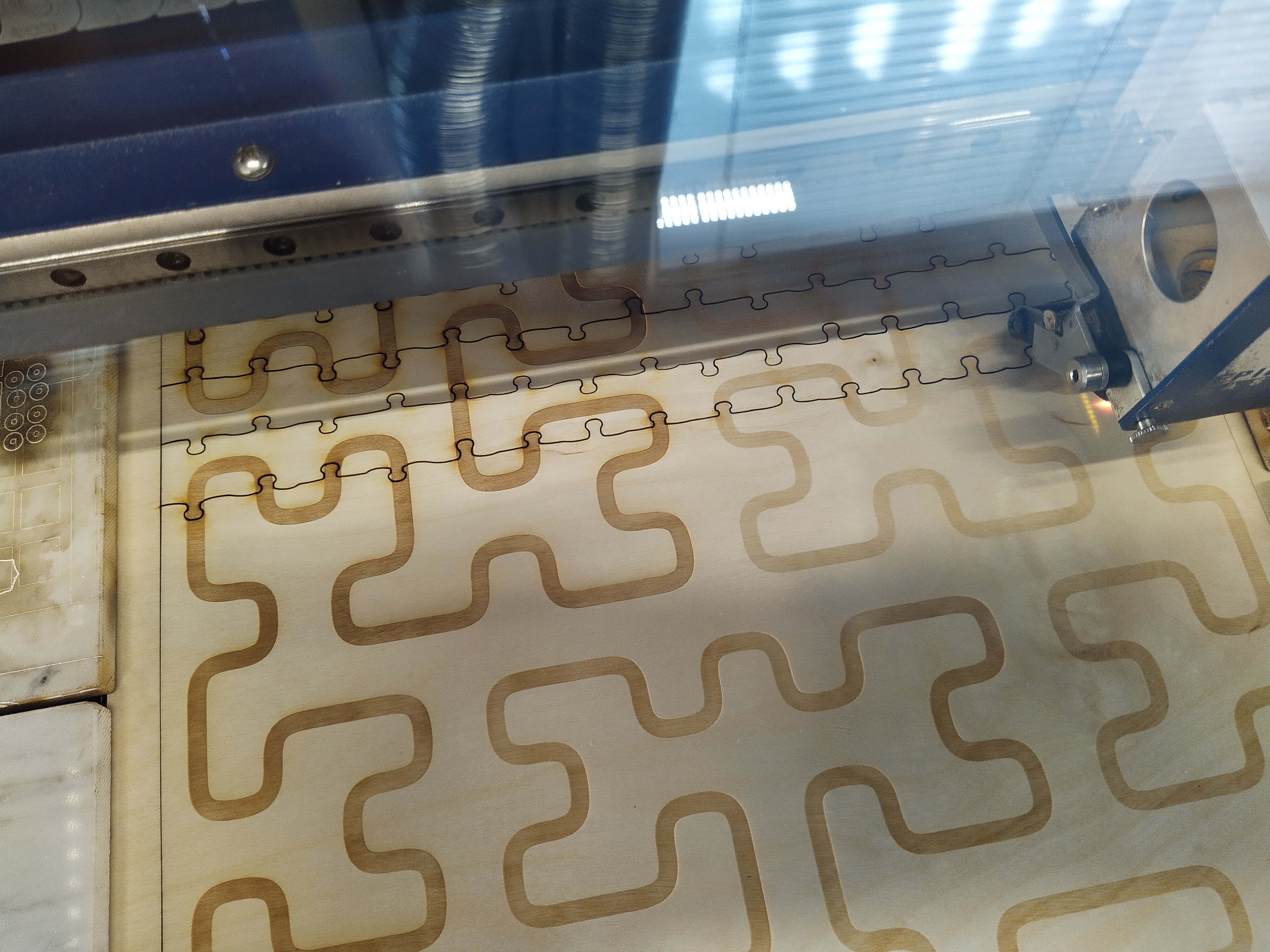
The only difference from the original laser cutting job was the prominent yellow flame when the grid was being cut. It probably comes from the paper and glue getting burned off by the laser. Fortunately this did not start a fire or char the printed surface.

After cutting the pieces can be separated.

All that's left is to assemble the puzzle.

As you can probably guess from this comparison picture, assembling the color version was much easier. For any piece it was immediately obvious where in the final puzzle it should go and classifying pieces to separate groups by color was straightforward. I did not even need to assemble the edges first as one typically does with regular jigsaw puzzles. It would have been harder than just following the color gradient line.

Putting it all together we find that with a printer, laser cutter and some ingenuity and elbow grease it is possible to create a product that, according to their own words, major jigsaw puzzle manufacturing plants were not able to produce.

Which is nice.

Tuesday, June 14, 2022

Attempting to create an aesthetic global line breaking algorithm

The Knuth-Plass line breaking algorithm is one of the cornerstones of TeX and why its output looks so pleasing to read (even to people who do not like the look of Computer Modern). While most text editors do line breaking with a quick & dirty algorithm that looks at each line in isolation, TeX does something fancier called minimum raggedness. The basic algorithm defines a global metric over the entire chapter and then chooses line breaks that minimize it. The basic function is the following:

For each line measure the difference between the desired width and the actual width and square the value. Then add these values together.

As you can easily tell, line breaks made at the beginning of the chapter affect the potential line breaks you can do later. Sometimes it is worth it to make a locally non-optimal choice at the beginning to get a better line break possibility much later. Evaluating a global metric like this can be potentially slow, which is why interactive programs like LibreOffice do not use this method.

The classical way of solving this problem is to use dynamic programming. It has the requirement that the problem must conform to a requirement called the Bellman optimality condition (or, if you are into rocketry, the Pontryagin maximum principle). This is perhaps best illustrated with an example: suppose you are in Paris and want to drive to Venice. This requires picking some path to drive that is "optimal" for your requirements. Now suppose we know that Zürich is along the path of this optimal route. The requirement basically says, then, that the optimal route you take from Paris to Zürich does not in any way affect the optimal route from Zürich to Venice. That is, the two paths can be routed independently of each other. This is true for the basic form of Knuth-Plass line breaking.

It is not true for line breaking in practice.

As an example there is an aesthetic requirement that there should not be three or more consecutive lines that end with a hyphen. Suppose you have split the problem in two and that in the top part the last two lines end with a dash and that the first line of the bottom part also ends with a dash. Each of the two parts is optimal in isolation but when combined they'd get the additional penalty of three consecutive hyphens and thus said solution might not be globally optimal.

So then what?

Computers today are a fair bit faster than in the late 70s/early 80s when TeX was developed. The problem size is also fairly small, the average text chapter only contains a few dozen lines (unless you are James Joyce). This leads to the obvious question of "couldn't you just work harder rather than smarter and try all the options?" Sadly the deities of combinatorics say you can't. There are just too many possibilities.

If you are a bit smarter about it, though, you can get most of the way there. For any given point in the raw text there are reasonably only a few places where you could place the optimal line break since every line must be "fairly smooth". The main split point is the one "closest" to the chapter width and then you can try one or two potential split points around it. These choices can be examined recursively fairly easily. So this is what I implemented as a test.

It even worked fairly well for a small sample text and created a good looking set of line breaks in a fraction of a second. Then I tried it with a different sample text that was about twice as long. The program then froze taking 100% CPU and producing no results. Foiled by algorithmic complexity once again!

After a bunch of optimizations what eventually ended up working was to store, for each split point, the N paths with the smallest penalties up to that point. Every time we enter that point the penalty of the current path is evaluated and compared to the list. If the penalty is larger than the worst option then search is abandoned. The resulting algorithm is surprisingly fast and could possibly even be used in real time.

The GUI app

Ideally you'd want to have tests for this functionality. This is tricky, since there is no golden correct answer, only what "looks good". Thus I wrote an application that can be used to examine the behaviour of the program with different texts, fonts and other parameters.

On the left you have the raw editable text, the middle shows how it would get rendered and on the right are the various statistics and parameters to twiddle. If we run the optimization on this piece of text the result looks like this:

For comparison here's what it looks like in LibreOffice:

And in Scribus:

No sample picture of TeX provided because I have neither the patience nor the skills to find out how to make it use Gentium.

While the parameters are not exactly the same in all three cases, we can clearly see that the new implementation produces more uniform results than the existing ones. One thing to note is that in some cases the new method creates lines that are a bit wider than the target box, where the other two never do. This causes the lines to be squished when justified and it looks really bad if done even a bit too much. The optimization function would probably need to be changed to penalize wide lines more than narrow ones.

The code

Get it here. It uses Gtk 4 and a bunch of related tech so getting it to work on anything else than Linux is probably a challenge.

There are a bunch of optimizations one could do, for example optical margin alignment or stretching individual letters on lines that fall far from the target width.

Thanks to our sponsor

This blog post was brought to you in part by two weeks of sick leave due to a dislocated shoulder. Special thanks to the paramedics on call and the fentanyl they administered to me.

Tuesday, June 7, 2022

Creating your own math-themed jigsaw puzzle from scratch

 Don't you just hate it when you get nerd sniped?

I don't either. It is usually quite fun. Case in point, some time ago I came upon this YouTube video:

It is about how a "500 piece puzzle" usually does not have 500 pieces, but instead slightly more to make manufacturing easier (see the video for the actual details, they are actually quite interesting). As I was watching the video I came up with an idea for my own math-themed jigsaw puzzle.

You can probably guess where this is going.

The idea would not leave me alone so I had to yield to temptation and get the damn thing implemented. This is where problems started. The puzzle required special handling and tighter tolerances than the average jigsaw puzzle made from a custom photo. As a taste of things to come, the final puzzle will only have two kind of pieces, namely these:


For those who already deciphered what the final result will look like: good job.

As you can probably tell, the printed pattern must be aligned very tightly to the cut lines. If it shifts by even a couple of millimeters, which is common in printing, then the whole thing breaks apart. Another requirement is that I must know the exact piece count beforehand so that I can generate an output image that matches the puzzle cut.

I approached several custom jigsaw puzzle manufacturers and they all told me that what I wanted was impossible and that their manufacturing processes are not capable of such precision. One went so far as to tell me that their print tolerances are corporate trade secrets and so is the cut used. Yes, the cut. Meaning the shapes of the resulting pieces. The one feature that is the same on every custom jigsaw puzzle and thus is known by anyone who has ever bought one of them. That is a trade secret. No, it makes no sense to me either.

Regardless it seemed like the puzzle could not be created. But, as the old saying goes, all problems are solvable with a sufficient application of public libraries and lasers.

This is a 50 Watt laser cutter and engraver that is freely usable in my local library. This nicely steps around the registration issues because printing and cutting are done at the same time and the machine is actually incredibly accurate (sub-millimeter). The downside is that you can't use color in the image. Color is created by burning so you can only create grayscale images and the shade is not particularly precise, though the shapes are very accurate.

After figuring this out the procedure got simple. All that was needed was some Python, Cairo and 3mm plywood. Here is the machine doing the engraving.

After the image had been burned, it was time to turn the laser to FULL POWER and cut the pieces. First sideways

then lengthwise.

And here is the final result all assembled up.

This is a 256 piece puzzle showing a Hilbert Curve. It is a space filling curve, that is, it travels through each "pixel" in the image exactly once in a continuous fashion and never intersects itself. As you can (hopefully) tell, there is also a gradient so that the further along the curve you get the lighter the printing gets. So in theory you could assemble this jigsaw puzzle by first ordering the pieces from darkest to lightest and then just joining the pieces one after the other.

The piece cut in this puzzle is custom. The "knob" shape is parameterized by a bunch of variables and each cut between two pieces has been generated by picking random values for said parameters. So in theory you could generate an arbitrarily large jigsaw puzzle with this method (it does need to be a square with the side length being a power of two, though).

Tuesday, May 24, 2022

A look in the game design of choose-your-own-adventure books

After a long covid pause I visited my parents' house. I took some things back with me, such as this:

This is a choose your own adventure book that originally belonged to my big sister. For those who don't speak Finnish, the book is called The Haunted Railway Book and it uses the characters from Enid Blyton's Famous Five, which is a well known series of adventure books for children (or maybe YA, don't know, I haven't actually read any of them).

The game itself is fairly involved. Instead of just doing random choices you have multiple items like a map and a compass that you can obtain and lose during the game and even hit points that are visualised as, obviously, food. I figured it might be interesting to work out how the game has been designed. Like all adventure game books the story has been split into different numbered chapters and you progress in the story by going from one chapter to another according to the rules.

In other words the game is a directed acyclic graph. Going through the entire book and writing it out as a Graphviz file, this is what the adventure looks like. The start point is at the top and to win you need to get to the second to last node without losing all your hit points and having the code book in your possession. The gv file is available in this repo for those who want to examine it themselves.

The red nodes are those where you lose one hit point. As you can tell the game really does not go easy on the player. The basic game design principle is simple. At first the decision tree fans out to give a sense of freedom and then chokes back down to a single node or few where important plot points are presented. This pattern then repeats until the story ends. In this way the game designers know that no matter how the player gets to the endgame, they have been told certain facts. Given that this book was designed in the late 70s or early 80s when computers were not that easily accessible this approach  makes designing the game a lot easier as each story segment is fully isolated from all others.

Looking closer we can see how the hit point mechanism works.

This is a repeating pattern. The game checks if you have a given item. If you don't have it you lose one hit point. In either case the plot goes on to the same point. Note how the child nodes have very different numbers. One assumes that if they were consecutive the player might read both branches and feel cheated that the event had no real influence on the story.

One thing that I wanted to find out was whether the game had any bugs or shortcuts you could take. There do not seem to be any. When I first wrote the graph down there was indeed one path that jumped past several plot nodes. I verified that it was not a transcription error and it did not seem to be. So either the original game had a bug or the Finnish translation had a typo.

Then I re-verified the transcription and found the issue.

In this chapter you need to use a code book to decipher a secret message, which seems to be the letters EJR that translate to "go to chapter 100". However the black triangly thing that is completely separate from the rest of the text (helpful arrow added by me) is actually part of the message and changes the content to "go to chapter 110". With this fixed the transition no longer jumps over plot nodes.  (The chapter text does say that the message is split over two separate bricks, but who reads instructions anyway.)

So what can we learn from this? Graphic design is important and too much whitespace can lead to smugglers escaping the long arm of the law and the short arm of child detectives.

Sunday, May 22, 2022

Sometimes the real world gives you unexpected comedy gold

(FTR: I did not write either one of those tweets, these are just two consecutive items that showed up on my timeline.)