Wednesday, March 22, 2023

In which you find out that everything you assumed was wrong

The previous post listed an algorithm for converting TrueType glyph advances into PDF glyph widths. It worked, but was weird, kludgy, complicated and all around bad. It was also completely wrong. As in "not even remotely in the direction of the correct solution" but it happened to work by accident with the examples I had. Trying it with some more fonts yields the now familiar error.

What makes debugging this issue harder is that Freetype exposes the same information multiple times. There are three or four different places where glyph advancement can be read and multiple multipliers that could potentially be used. No combination of these provides a value that would be even relatively close to the correct one.

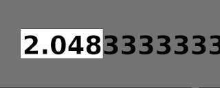
So let's work backwards. What is the multiplier that we need to get? A single example says that a glyph with font advancement 1229 should have a PDF width value of 600. Therefore 1229/600 = 2.048333, and we should divide by roughly half.

Waitaminute!

Hmmmmm.

After some debugging one can find a struct entry that is set to 1000 for fonts that work and 2048 for those that don't: face->units_per_EM. This scaling value is arbitrary but most (but not all) Adobe Type 1 fonts use 1000 while most (but not all) TrueType fonts use 2048. PDF uses 1000, probably to mach Type 1 conventions. This is even documented in the PDF specification 1.7, section 9.2.4, page 241: "For all font types except Type 3, the units of glyph space are one-thousandth of a unit of text space". This is incredibly easy to miss when reading the 700+ pages of text in the specification. I know because I did it. Several times.

Monday, March 20, 2023

The joy of font debugging

Remember how in the previous blog post it was said that creating text in PDF would be "just a matter of setting some parameters"?

Well let's start by creating the main text in two justified columns.

Ok, nice. Next we add an author name.

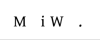
Whoopsies. After some debugging one can find out that this only happens if you only use fewer than 32 characters from the font you are subsetting. Obviously. But no matter, after fixing this minor niggle we only need to display the title, author names and finally an email address. This is more of the same so nothing can go wrong.

After some hours of debugging it becomes clear that the values of left side bearings are sometimes read from the source file using incorrect offsets (while still being 100% memory safe, all accesses are inside the source data). Good Now that that's fully fix...

This is where things get extremely weird. No matter where you look or how deeply you peruse the binary data files, nothing seems to be incorrect. Maybe this is a bug in the Noto Mono font used here? So you try Liberation Mono. It fails too. And then, just to be sure, you try Ubuntu Mono. It works correctly. As does Free Mono.

Hmmmmmhmhm.

Opening the file in Fontforge says that the width of all characters is 1228 font units. That is also what Freetype reports. Which is comforting because in the TrueType file format struct fields that are designated as 32 bit integers might be either a) 32 bit integer b) 26.6. fixed point or c) 16.16 fixed point. You can't ever really be sure which, though, because it depends on values of bitfields far and away from the actual structs themselves.

Things get even weirder if you test exporting a PDF that uses those broken fonts either with Cairo or LibreOffice. In the generated PDF files the width of characters in this font to 600. Not 1228. Trying to read their source to find out how and why they do this is problematic, because they support many different font formats and thus convert the input data to their internal representation and then generate the output from those. Trying to understand how the input data correlates with the output data can give you a major headache without even trying too hard.

The actual solution is even weirder than all of the above. TrueType fonts store the horizontal metrics of glyphs in a table called hmtx. It stores both the glyph advance and left side bearings. As a special case you can only specify the latter and use a common value for the former. This provides space savings of UP TO 2 BYTES PER CHARACTER but the downside is more complex parsing. Further, going through Freetype's public structs reveals that they contain a field called x_scale. After a lot of trial error you can eventually decipher the actual algorithm needed:

If the character has both glyph advance and left side bearings defined than you use them as-is but if it only has left side bearings defined then you must divide the default width value with the scale.

Then finally.

Addendum: Freetype

Freetype has many flags and knobs to specify whether you want metrics in original font coordinates or "output coordinates". I could not come up with a combination that would have provided consistent values, some postprocessing seems to always be needed. This might be a bug, it might be a limitation of the TrueType format, it might be something completely different. I don't really know, and I don't have the energy to dig further to uncover the underlying issue.
Thursday, March 16, 2023

The PDF text model is quite nice, actually

As was discussed earlier, the way PDF handles fonts and glyphs is arcane and tedious. It takes a lot of boilerplate and hitting your shins against sharp stones to get working. However once you do and can turn to the higher level text functionality, things become a lot nicer. (Right-to-left, vertical and calligraphic scripts might be more difficult, but I don't know any of those.)

The PDF text drawing model provides a fairly wide selection of text operations.

If you, for example, want to produce a paragraph of justified text, first you need to calculate how the text should be split in lines and the additional word and character scaling parameters needed. Then the text can be rendered with the following pseudocode:

  • Create a text object with the correct font and position.
  • Set spacing values for the current line.
  • Output the current line of text (add kerning manually if it is in a format Freetype does not handle)
  • Repeat the above two steps until the paragraph is done
  • Close the text object
This shifts the burden of having to compute each letter's exact location from you to the PDF renderer. If you need more precision than this, then you need to dig out Harfbuzz, and draw the glyphs one by one to precomputed coordinates.

Sunday, March 12, 2023

First A4PDF release, version 0.1.0 "embarrasment"

The time has come to make the first technical preview release of A4PDF, nicknamed embarrasment. The name stems from this statement.

If you're not embarrassed by the first version of your product, you've launched too late.

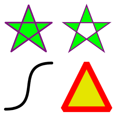
It does not do much yet, but the basics are there to draw shapes, text and images using a plain C API:

A pkg-config file is also provided. There is also a Python wrapper to run scripts like these:

Distro packaging

People should probably not do any distro packaging yet, as the library is neither ABI nor even API stable. However if someone wants to build deb packages, the source portion of Debian control file would look something like this:

Source: a4pdf
Maintainer: Bob McBob <bob@example.org>
Section: misc
Priority: optional
Standards-Version: 3.9.2
Build-Depends: debhelper (>= 10),
  liblcms2-dev,
  libpng-dev,
  libjpeg-dev,
  libgtk-4-dev,
  libfmt-dev,
  libfreetype-dev,
  meson,
  python3-pil,
  fonts-noto-core,
  ghostscript

Saturday, March 11, 2023

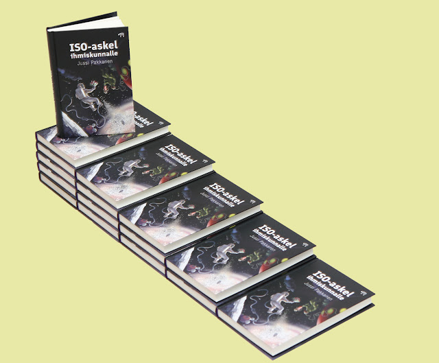
My book is finally available for purchase

A major difference between software and book projects is that the latter have a point when they can be considered complete and finished. For my debut novel, that time has come.

The text block has been created with a "mini-LaTeX" DTP program that I wrote basically from scratch. This caused "fun" things to happen. For example I got an email from the printing house some four days before the unveiling event that the book contains words that were not hyphenated according to recommended style guides. I was aware of said style guides, had added handling for those and even had unit tests to ensure that they work. And yet in production they did not work. This lead to a very stressful debugging session where you know that the only person in the world that can fix it is you, and that there is a very strict and personal deadline.

The actual PDF generation was done with Cairo and Pango. Surprisingly there were zero issues with them, the printer accepted them just fine and the printout looks great. The cover was made with Scribus and it did have several issues none of which had anything to do with Scribus itself, just that doing a full color managed print job is to this day a bit tricky. did have to postprocess Cairo's output with Ghostscript because Cairo only produces PDFs in the RGB colorspace whereas printers require grayscale PDFs.

The "back blurb"

Humanity has managed to create the technology needed for interstellar travel and civilizations from outer space have invited them to visit. The people of Earth immediately begin work on creating a space ship suitable for the journey, with stylish appearance being their number one priority. Eventually the ship gets under way commandeered by an egomaniacal captain and staffed by a nerve wrecked crew. What they don't know is who they are actually going to meet, what they should do once they get there and why the ships has an ice rink.

[Name of book would go here, but I could not come up with a proper translation as the original is a pun] mixes classical space sci-fi, scientifically accurate technology and dark comedy into a hypergolic stew, whose blast wave nothing can survive intact — not even space sex.

Where to get it?

Every now and then people ask me how they could support Meson financially. Buying this book is by far the best way to do that at the current time. Yes, it is in Finnish, so most people reading this blog post can't comprehend it, but reading it is optional, you can just buy it to keep on your coffee table for maximal hipster street cred. :)

Finnish people who prefer getting their books via libraries can request it via online forms such as this one.

Sunday, March 5, 2023

The code functionality tipping point

Software development is weirdly nonlinear. When you start working on a new project at first it does not really do much. Adding more and more code does not seem to help. The "end user visible" functionality is pretty poor and it does not seem to get visibly better. You can do something, but nothing that would be actually useful.

This goes on for some amount of time that can't be predicted.

And then, unexpectedly, the pieces come together and useful functionality jumps from "almost nothing" to "quite a lot, actually".

Case in point. Up until yesterday a4pdf was pretty much useless. But today you can take this piece of Python code:

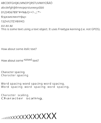
to produce a PDF that looks like this: