The major C++ compilers are starting to ship modules implementations so I figured I'd add more support for those in Meson. That resulted in this blog post. It will not be pleasant or fun. Should you choose to read it, you might want to keep your emergency kitten image image reserve close at hand.
At first you run into all the usual tool roughness that you'd expect from new experimental features. For example, GCC generates dependency files that don't work with Ninja. Or that Clang's module scanner does not support a -o command line argument to write results to a file, but instead it dumps them to stdout. (If you are the sort of person who went "pfft, what a moron, he should learn to use shell forwarding" then how would you like it if all compilers dumped their .o files to stdout?) The output of the scanner is not usable for actually building the code, mind you, it needs to be preprocessed with a different tool to convert its "high level" JSON output to "file based" dep files that Ninja understands.
Then you get into deeper problems like the fact that currently the three major C++ compilers do not support a common file extension to specify C++ module sources. (Or output binaries for that matter.) Thus the build system must have magic code to inject the "compile this thing as that thing" arguments for every source. Or, in the case of CMake, have the end user manually type the format of each source file, even if it had an extension that uniquely specifies it as a module. No, I am not kidding.
Then things get even worse, but first let's set a ground rule.
The basic axiom for command line tools
One could write a blog post as long as, or longer than, this one just explaining why the following requirement is necessary. I'm not going to, but instead just state it as an axiom.
For a given data processing tool, one must be able to determine all command line arguments the tool needs to do its job without needing to examine contents of its input files.
As a very simple example, suppose you have an image file format named .bob, which can be either a png file or a jpg file and you have a program to display image files on screen. Invoking it as showimage image.bob would be good. Requiring users to invoke the program with showimage image.bob --image-is-actually-a=png would be bad.
Every time you end up with a design that would violate this requirement, the correct thing to do is to change the design somehow so that the violation goes away. If you disagree with this claim, you are free to do so. Just don't send me email about it.
A brief overview of how build systems work
The main pipeline commonly looks like this for systems that generate e.g. Makefiles or Ninja files.
The important step here is #3. A Ninja file is static, thus we need to know a) the compilation arguments to use and b) interdependencies between files. The latter can't be done for things like Fortran or C++ modules. This is why Ninja has a functionality called dyndeps. It is a way to call an external program that scans the sources to be built and then writes a simple Makefile-esque snippet describing which order things should be built in. This is a simple and understandable step that works nicely for Fortran modules but is by itself insufficient for C++ modules.
Once more into the weeds, my friends!
As an example let's examine the Clang compiler. For compiling C++ modules it has a command line argument for specifying where it should put the output module file: -fmodule-output=somewhere/modulename.pcm. The output file name must be same as the module it exports (not actually true, but sufficiently true for our purposes). Immediately we see the problem. When the Ninja file is first generated, we must already know what module said file exports. Or, in other words, we have to scan the contents of the file in order to know what command line argument we need to pass to it.
In reality even that is not sufficient. You need to parse the contents of said file and all its compiler arguments and possibly other things, because the following is perfectly valid code (or at least it compiles on Clang):
module;
#include<evil.h>
export module I_AM_A_DEFINE_GOOD_LUCK_FINDING_OUT_WHERE_I_COME_FROM;
In other words in order to be able to compile this source file you first need to parse the source file and all included sources until you hit the export declaration and then throw away the result. Simpler approaches don't work because the only thing that can reliably parse a C++ source file is a full C++ compiler.
C++ has to support a lot of stupid things because of backwards compatibility. In this case that does not apply, because there is no existing code that would require this to keep working. Defining a module name with the preprocessor should just be made invalid (or at least ill defined no diagnostics required).
Even worse, now you get into problems with reconfiguration. You want to minimize the number of reconfigurations you do, because they are typically very slow compared to just rerunning Ninja. In order to be reliable, we must assume that any change in a module source file might change the module name it generates. Thus we need to change the compiler flags needed to build the file, which means recreating the Ninja file, which can only be done by running reconfigure.
Ninja does not support dynamic compiler argument generation. Which is good, because it makes things faster, simpler and more reliable. This does not stop CMake, which hacked it on top anyway. The compiler command they invoke looks like the following.
clang++ <some compiler flags> @path/to/somefile.modmap <more flags>
The @file syntax means "read the contents of the file and pretend that it contains command line arguments". The file itself is created at build time with a scanner program. Here's what its contents look like.
-x c++-module
-fmodule-output=CMakeFiles/modtest.dir/M0.pcm
-fmodule-file=M1=CMakeFiles/modtest.dir/M1.pcm
-fmodule-file=M2=CMakeFiles/modtest.dir/M2.pcm
-fmodule-file=M3=CMakeFiles/modtest.dir/M3.pcm
-fmodule-file=M4=CMakeFiles/modtest.dir/M4.pcm
-fmodule-file=M5=CMakeFiles/modtest.dir/M5.pcm
-fmodule-file=M6=CMakeFiles/modtest.dir/M6.pcm
-fmodule-file=M7=CMakeFiles/modtest.dir/M7.pcm
-fmodule-file=M8=CMakeFiles/modtest.dir/M8.pcm
-fmodule-file=M9=CMakeFiles/modtest.dir/M9.pcm
This file has the output filename as well as listing every other module file in this build target (only M1 is used by M0 so the other flags are superfluous). A file like this is created for each C++ source file and it must remain on disk for the entire compilation. NTFS users, rejoice!
The solution that we have here is exceedingly clever. Unfortunately the word "clever" is used here in the pejorative sense, as in "aren't I super clever for managing to create this hideously complicated Rube Goldberg machine to solve a problem caused by people not communicating with each other". This is a "first beta" level solution. The one where you prove that something can be done and which you then improve to be actually good. But no, CMake has decreed module support as "done", so this is what you are going to be stuck with for the foreseeable future.
AFAICT this setup has been designed mostly by CMake devs. Which kind of makes you wonder. Why would a company that makes a lot of money consulting and training people on their product make the practical use of C++ modules really hard for competing projects to implement? That would make it an even bigger burden to replace their software with something else? What kind of business goal could that possibly serve?
An interlude that is 100% unrelated to anything discussed above
There is a proposal for Sandia National Laboratories to fund Kitware to create a new front end language to CMake. Page 4 of the Powerpoint presentation on that page looks like this (emphasis mine):
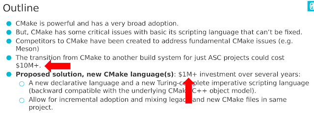
I have no way of knowing how large the code base in question is. The document mentions on page 10 that a port from Autotools to CMake cost $1.2 million, 500k of which was internal costs and 700k went to Kitware for implementing basic functionality missing in CMake. For comparison the Cocomo estimate for Meson in its entirety is only $1.3 million. I don't know how much code they have but I have ported several fairly hefty projects from one build system to another and none of them has gotten even close to $50k. The text does not say if the $10 million includes internal costs as well as external (it probably does), but the $1 million one seems to be purely external costs. The cost of updating existing CMake code to use the new syntax seems to be ignored (or that is my interpretation of the doc, anyway).
Without knowing the true ratio of internal costs (training, recertification etc) over total costs it is hard to compare the two numbers. But just for reference, if one were to charge $100 an hour, $10 million would get you 100k hours. At 8 hours per day that means 12.5k days or 2500 weeks or 625 months or 56 years at 11 months per year. Even a million would last for over five years of full time effort. That's a lot of time to spend on converting build systems.
We now return to your regularly scheduled program.
Is there a better design?
Maybe. Let's start by listing the requirements:
- All command lines used must be knowable a priori, that is, without scanning the contents of source files
- Any compiler may choose to name its module files however it wants, but said mapping must be knowable just from the compiler name and version, i.o.w. it has to be documented
- Changing source files must not cause, by itself, a reconfiguration, only a rescan for deps followed by a build of the changed files
- The developer must not need to tell which sources are which module types in the build system, it is to be deduced automatically without needing to scan the contents of source files (i.e. by using the proper file extension)
- Module files are per-compiler and per-version and only make sense within the build tree of a single project
- If module files are to be installed, those are defined in a way that does not affect source files with modules that do not need installing.
Fortran modules already statisfy all of these.
We split requirements between the tools as follows.
- It is the responsibility of the compiler to output files where told
- It is the responsibility of the build system to invoke compilations in the correct order to satisfy module requirements
The immediate consequence of this is that the Ninja file must not contain any command line arguments with module names in them.
For now we assume a project having only one executable target. The scheme is extended to multiple targets later.
To get this working we need a special built modules subdirectory. It is the responsibility of the build system to guarantee that every source file within a given build target is given the same directory via a command line argument.
For Clang this would mean that instead of specifying -fmodule-output=moddir/M0.pcm meaning "write the module to this file" you'd say -fmodule-output-dir=moddir meaning "I don't care what the name of the module is, just write it in the given directory using your own naming scheme". That directory is also implicitly used as a module import directory so any source file can do import foo for any module foo defined in the same target without any additional command line arguments. Other targets' module import dirs can be added with a separate command line argument (not specified here).
With this setup we don't need anything else. The command line arguments are always the same, the dependency scanner can detect when a file generates a module, what its output name and path is going to be and it can generate Ninja dyndep info to make compilations happen in the correct order. This is, more or less, how Fortran modules work and also how Meson's WIP module builder currently works. It has the added benefit that the scanner only invokes one process per build target, not one process per source file. You can only do this if the build system enforces that all sources within a target have the same command line arguments. Meson does this. CMake does not.
The scheme listed above has been tested for small projects but not at any sort of scale. No fundamental blockers to large scale use are known at this time but they might exist.
Multiple targets and subprojects
If you have a module executable A that uses module library B, you obviously need to compile all module producers of B before compiling any module consumers of A. You also need to tell A where the module files of B are.
The former is easy to do with phony targets if you are willing to tolerate that all compilations of B (but not linking) need to happen before any compilations of A. That causes a minor build time hit, but since one of the main features of modules were faster build times, you should still come out ahead.
There are two solutions to the latter. The first one is that when you add a link dependency of B to A, you also add its module output directory to the module input path of A. The other, and much simpler, solution is that the module output directory is shared between all build targets and subprojects within a single build tree. It could be called, for example, built-modules and be at the root dir of the build tree. The only real downside is that if your project defines a module with the same name in two different source files, there would be a clash. But if that is the case your build setup is broken already due to potential module-ODR violations, and bailing out is the sensible thing to do.