In previous blog posts there was some talk about implementing a simple system that generates books (both PDF and ebook) from plain text input files. The main question for that is what the input format should be. Currently there are basically two established formats: LaTeX and Markdown. The former is especially good if the book has a lot of figures, cross references, indexes and all that. The latter is commonly used in most modern web systems but it is more suitable to specifying text in the "web page" style as opposed to "split aesthetically over pages".
The obvious solution when faced with this issue is to design your own file format that fits your needs perfectly. I did not do that, but instead I did think about the issue and did some research and thinking. This is the outcome of that. It is not a finished product, you can think of instead as a grouping of unrelated things and design requirements that you'd need to deal with when creating such a file format.
Goals
The file format should be used to create traditional novel like Lord of the Rings and The Hitch-Hiker's Guide to the Galaxy. The output will be a "single flow" of text separated by chapter headings and the like. There needs to be support for different paragraph styles for printing things like poems, telegraphs or computer printouts in different fonts and indents.
The input files must be UTF-8 plain text in a format that works natively with revision control systems.
Supporting pictures and illustrations should be possible.
You need to be able to create both press-ready PDFs and epubs directly from the input files without having to reformat the text with something like Scribus.
Don't have styling information inside the input files. Those should be defined elsewhere, for example when generating the epub, all styling should come from a CSS file that the end user writes by hand. The input text should be as "syntax-only" as possible.
Writing HTML or XML style tags is right out.
Specifying formatting inline
Both LaTeX and Markdown specify their style information inline. This seems like a reasonable approach that people are used to. In fact I have seen Word documents written by professional proofreaders that do not use Word's styling at all but instead type Markdown-style formatting tokens inside Word documents.
The main difference between LaTeX and Markdown is that the former is verbose whereas the latter is, well, not as simple as you'd expect. The most common emphasis style is italic. The LaTeX way of doing it is to write \emph{italic} whereas Markdown requires it to be written as _italic_. This is one of the main annoying things about the LaTeX format, you need to keep typing that emph (or create a macro for it) and it takes up a lot of space in your text. Having a shorthand for common operations, like Markdown does, seems like an usability win. Typing \longcommand for functionality that is only used rarely is ok.
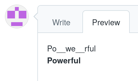
These formatting tokens have their own set of problems. Here's something you can try in any web site that supports Markdown formatting (I used Github here). Write the same word twice: one time so that the middle of the word has styling tokens and a second time so that the entire word is emphasized.

Then click on the preview tab.

Whoops. One of the two of these has unexpected formatting. Some web editors even get this wrong. If you use a graphical preview widget and emphasize the middle of the word using ctrl-i, the editor shows it as emphasized but if you click on the text tab and then return to the preview tab it shows the underscore characters rather than italic text.
This might lead you to think that underscores within words (i.e. sequences of characters separated by whitespace) are ignored. So let's test that.

This is a simple test with three different cases. Let's look at the outcome.

Our hypothesis turned out incorrect. There are special cases where underscores within words are considered styling information and others where they should be treated as characters. It is left as an exercise to the reader to 1) determine when that is and 2) what is the rendering difference between the two lower lines in the image (there is one).
Fair enough. Surely the same applies for other formatting as well.

This turns into:

Nope, behavioural difference again! But what if you use double underscores?

Okay, looking good. Surely that will work:
Nope. So what can we learn from this? Basically that in-band signaling is error prone and you typically should avoid it because it will come back and bite you in the ass. Since the file format is UTF-8 we could sacrifice some characters outside basic ASCII for this use but then you get into the problem of needing to type them out with unusual keyboard combinations (or configure your editor to write them out when typing ctrl-i or ctrl-b).
Small caps
Small caps letters are often used in high quality typography. In LaTeX you get them with the \textsc command. Markdown does not support small caps at all. There are several discussion threads that talk about adding support for it to Markdown. To save you time, here is a condensed version of pretty much all of them:
"Can we add small caps to Markdown?"
"No, you don't need them."
"Yes I do."
"No you don't."
And so on. Small caps might be important enough to warrant its own formatting character as discussed in the previous chapter and the implementation would have the same issues.
The dialogue clash
There are many different ways of laying out dialogue. Quotation marks are the most common but starting a paragraph with a dash is also used (in Finnish at least, this might be culture dependent). Like so:
– Use the Force Luke, said Obi-Wan.
Thus it would seem useful to format all paragraphs that start with a dash character as dialogue. In this example the actual formatting used an en-dash. If you want to go the Markdown way this is problematic, because it specifies that lines starting with dashes turn into bulleted lists:
- Use the Force Luke, said Obi-Wan.
Please make sure it supports BiDi!
ReplyDeleteThe quirky Markdown behaviour regarding emphasis you describe is specific to GitHub Flavoured Markdown, see
ReplyDelete