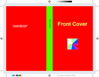
Going from the simple color managed PDF generator discussed in the previous blog post into something more useful requires getting practical. So here is a screenshot of a "print ready" PDF document I generated with the code showing a typical layout you'd use for a softcover book. As printers can't really print all the way to the edges of paper, the cover needs to be printed to a larger sheet and then cut to its final size.
It's not of artistically high quality, granted, but most of the technical bits are there:
- The printed page is noticeably bigger than the "active area" and has a bunch of magic squiggles needed by the printing house
- The output is fully color managed CMYK
- The gray box represents the bleed area and in a real document the cover image would extend over it, but I left it like this for visualization purposes.
- Text can be rendered and rotated (see spine)
- The book title is rendered with gold ink, not CMYK inks
- There are colorbars for quality control
- The registration and cut marks (the "bullseyes" and straight lines at paper corners, respectively) are drawn on all plates using PDF's builtin functionality so they are guaranteed to be correctly aligned
- None of the prepress marks are guaranteed to be actually correct, I just swiped them from various sources

Looking at this you can find several interesting things. For example the gray box showing the bleed area is composed of C, M and Y inks instead of only K, even though it was originally defined as a pure gray in RGB. This is how LittleCMS chose to convert it and it might or might not be what the original artist had in mind. High quality PDF generation is full of little quirks like this, blindly throwing numbers at color conversion functions is not enough to get good results, end users might need fairly precise control over low level operations.
Another thing to note is how the renderer has left "holes" for the book title in CMYK plates even though all color is in the gold ink plate. This avoids mixing inks but on the other hand requires someone to do proper trapping. That is its own can of worms, but fortunately most people can let the RIP handle it (I think).
No comments:
Post a Comment